Another post long past due! Let me start by saying, I like nice graphics.
I\’m not alone in this either, as any mainstream game would suggest. Graphics are the single most improved aspect of gaming since Mario. Classic game mechanics have remained largely unchanged or modified slightly and innovation comes in short spurts between knockoffs of the last innovation. But, Lor\’ help us, we like our games to look nice! We like fancy textures, ambient lighting, high poly counts and draw distances, anti-aliasing, reflective surface, nice water effects, smooth animation, particle shading bitmappers with hoozits/whatsits, and we want it all with a sense of style. However, the latter is where a majority of the gaming public become the mainstream dotards that snobs like me love to look down upon. It\’s a vice, I know, and I\’m working on it. Let me come back to the idea of style in a moment.
First, I want to confess my shallowness. There are games I just won\’t play because they don\’t look good. Fire Warrior comes to mind. I am a big fan of the Warhammer 40,000 setting and like to get as much of it as possible without touching the loathsomely expensive (and graduate-level nerdy) tabletop version. However, Fire Warrior didn\’t look good then and it doesn\’t look good now, especially for a PS2 game. The Tau looked weird, the Imperial Guards looked like rejects from a Halo prequel, and, well, there weren\’t Orks. There might have been but I didn\’t get that far. It also did not help that controls were, well, clunky.
Hinterland was another title with absolute shite for graphics. It was a solid concept but poorly executed, amplified by the rancid 1998-esque graphics. I beat it once and refuse to try it again.
There are more examples but I feel it\’s time to move on.
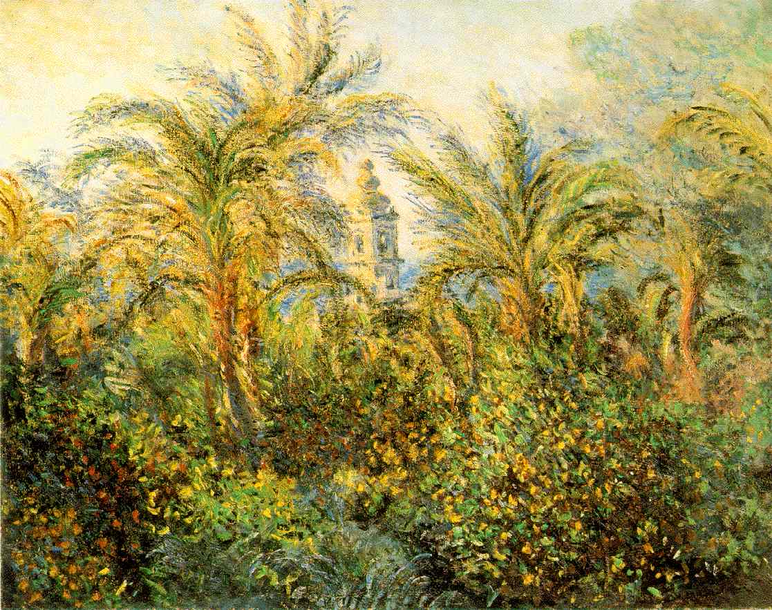
Let us return to this idea of style. Graphically speaking, a game can have the technical equivalent of used staples and candy wrappers but still have the style of Mos Def. It\’s a bit like impressionism; at first glance some impressionist art looks more like a colorful inkblot than fine art but once you get it it is a wonderful thing. Cybersolip is a recent example that comes immediately to mind. At first glance it looks like a blurry mess, not unlike some impressionist painters. Spend some time with the game, however, and you grow to see that it teeters more on artistic brilliance than sloppy design.
LOVE would be another obvious example because it looks, well, exactly like the above painting were it rendered on a modern graphics card. This, I believe, is why LOVE will never have mainstream success. Not to say that it was the goal at all, but people like to have nice things to look at and not think about. Who can blame them? In this age of stress, hype, superboredom, and work we need something simple to put our minds on cruise control from time to time. I myself will often skip very good games because they make me think too hard. After a day of work followed by school followed by the stresses of modern life I don\’t want to solve the problems of a fake world; oftentimes I just want to hack up orcs. The snooty, underground part of me thinks I have to like some of these artsy, progressive games, and most of the time I genuinely do, but it\’s easy to empathize with the gaming public that goes for the next \”big\” thing, even if it\’s just a shinier version of the last big thing.
A game can look great without looking great, but then there are times when a game achieves a righteous balance of both style and accessibility. Perhaps a better example, or one that will give me more street cred, will spring to mind but the immediate example is Katamari Damacy; even though it was on a generation-old system, it looked like a game two generations past. Blocky, polygonal models, a childish color palette, and cheap animation meant the game was far duller than the cutting edge, graphically, but you simply didn\’t care. The whimsical style looked good enough for its purposes but played ten times that; you simply wanted to roll up more lego people and square clouds. From a technical standpoint this was necessary; a PS2 could not handle so many objects drawn at once when you\’re rolling up, literally, a world if those objects are highly textured and smooth. So it was practical, accessible, stylish, and damned fun.
I have no real closing so I\’ll leave you with this thought: Who watches the watchmen?
